This is a guest blog post by the über-talented Amy Devereux. She’s been helping ReadMe make all things pretty, and is the designer behind 365cons.com.
As you may have noticed, we use a lot of icons here at ReadMe! They’re helpful to succinctly visually inform and also just to make things more fun to look at.
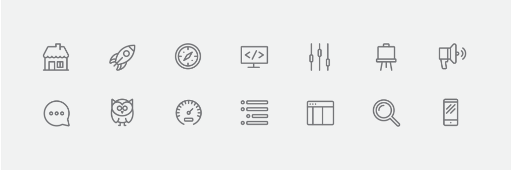
While right now we don’t create every single one of our icons, sometimes we have a specific idea or style in mind (like those above) and existing ones just don’t fit the bill. A lot of icon creation comes down to aesthetics, but there’s so much more to it than that. Here’s a mini behind-the-scenes look into a technical part of the process: pixel-perfection.
Get your grid on
The key aspect of iconography that we’re referring to is grid alignment. This is particularly important for the web, because without it, icons look fuzzy or even unidentifiable in use. To put it simply, the stroke edges must precisely match up with the gridlines.
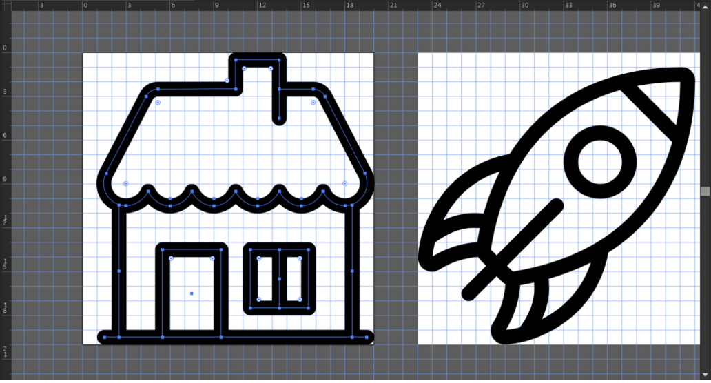
Even when SVGs are used, raster is the web’s native tongue. Because of this, these icons are created to scale, with each grid module in the vector file translating to one pixel. We used a square 20×20 pixel grid. These specs were chosen to maintain consistency with the other icons in use across our brand. There are varying viewpoints on file setup and stroke placement to achieve maximum precision (and we’ll get into that more later), but really you’ll usually be able to tell if something went wrong. How?
Let’s break it down
Essentially, any module with color in it will convert to a filled pixel—at an opacity that is determined by the percentage of color in the given square. Take the strokes below as an example: the one on the left is grid-aligned, the one on the right is not.
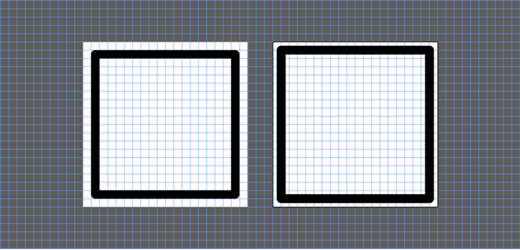
Here’s what happens when we look again at those same strokes, now in pixel preview:
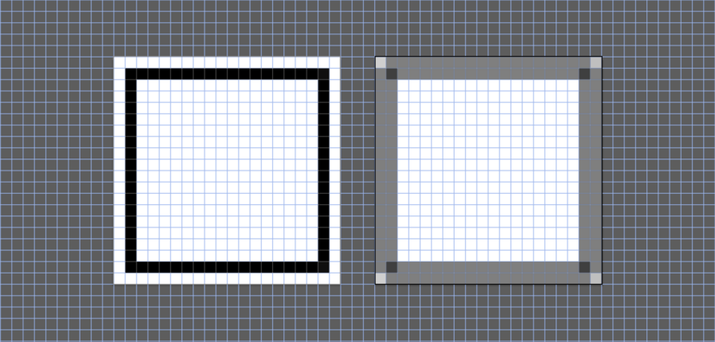
Gross, right? The smaller the pixel grid, the more noticeable it is. Of course, some gradation is normal—take circles, for instance. While there’s no way to perfectly line up the entire perimeter of a circle with the grid, the outer edges still must align to get the best result possible.
The even finer points
Now that we know why it’s important, let’s take a look some tips that make it more efficient and successful. We’ll show how we use Illustrator to create an icon font. If you’re not planning on making your own any time soon, feel free to skip past this minutia.
File setup
The main things to determine are artboard size and grid increments. As we briefly mentioned earlier, the internet doesn’t seem to agree on one right method. The great thing is that there are a lot of options, the not-so-great thing is that it can be confusing and even contradictory from one article to the next. Some approaches suggest using various artboard sizes with subdivisions to determine the modules, and others recommend calculating the pixel size with Pixels Per Em (PPM).
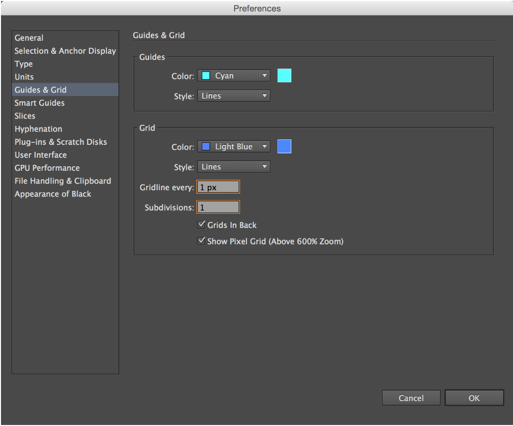
Our favorite approach is the 1:1 module-to-pixel ratio. Why? Since it doesn’t require any calculations, it’s universal across icon projects and easy to implement. Especially with small sizes, we’ve found this to be far and above the most reliable. This is achieved by creating your artboard to scale with gridline every 1px and subdivisions of 1. Easy peasy!
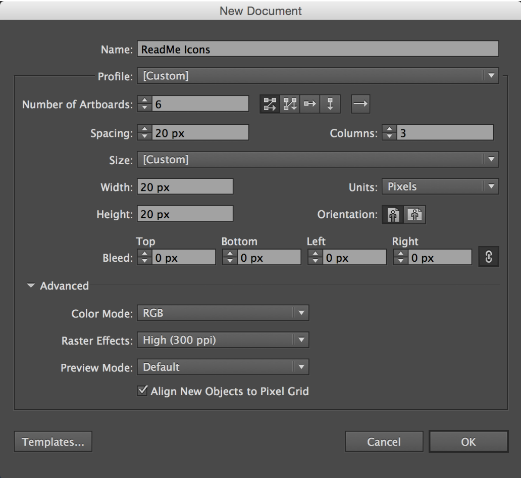
Create a new document. (Psst! Pick an artboard size that’s square and, if you’re adding to an icon font as we did, the same dimensions so that you retain consistency. Some common sizes for icons are 16×16, 20×20, 32×32, 40×40, 60×60.)
Then after hitting ‘OK’ go to into Preferences > Guides and Grid:
Best practices
There are a lot of little things that aid in a better output. Here’s a little breakdown of some tips to please the web gods:
Units
Set your general rulers and strokes to pixels right off the bat. Since you’re optimizing for pixels, it only makes sense to work in them, right?
Preferences > Units (Or Command + ,)
Keyboard Increments
This controls exactly how much an object moves when you use the arrow keys. Setting it to 1px is great for control because it repositions your object at the same increment as the grid modules. Keep in mind that if an object is a half a pixel off, it will nudge it to where it aligns to the next half pixel, not necessarily the grid. Nudging has never been more deliberate.
Preferences > General (Or Command + K)
Snap to Grid
Snapping to the grid ensures that when you move your object it doesn’t become misaligned. Because of our settings, in some instances this could be seen as duplicate the keyboard increment settings, but it really does more than that. For example, it’s good to have it turned on for when you’re dragging instead of nudging. It also will usually help to realign an object that may be offset. As a rule, we tend to leave it on, turning it off only if we need the program to take a chill pill from its rigidity for a second.
View > Snap to Grid (Or Shift + Command + ‘)
Snap to Point
As you probably guessed, snapping to point is very similar to snapping to the grid. Turning this on tells Illustrator to magnetize to anchor points and guides. This is extremely helpful for precision, such as when joining two points. We pretty much leave this on all the time too.
View > Snap to Point (Or Option + Command + ‘)
Even Stroke Weights
You’ll have a much easier time with your icons if you choose stroke weights that are even numbers. In order to fully fill the pixels, an odd number means the middle of your stroke is in the middle of a pixel, while an even number means the middle can align to a grid line. If you utilize the keyboard increments and point/grid snapping with even strokes, the process becomes almost automatic—it’ll snap to perfect alignment. Here’s how the strokes auto-align with a 5px and 6px width, respectively:
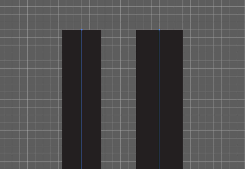
It’s easy to see how the left would cause those blurry icons. No bueno. If you’re not up for manually positioning, stick to the even figures.
Whole Values
In icon design, whole values are really important. Like we showed above, you want the edges to match up with the gridlines exactly. If your stroke is 4.567, it’s not filling the pixels evenly, which means—you guessed it—fuzzy icons. This is true for all elements in your file, even artboards! When it comes to iconography, decimals are from the devil.
Align to Pixel Grid
We have a love-hate relationship with this feature. Turning it on ensures that the dimensions of your object and their x/y coordinates are whole numbers (yay!). That being said, it also sometimes has a mind of its own. If you turn it on after creating an object, it will try to make it conform, often extremely distorting your work. It also can be seemingly contradictory—telling you that individual objects have whole values, but grouped they don’t. We’ve found it to be helpful on a case-by-case basis. Befriend the Transform palette so that you can manually input figures as needed, but don’t overly stress about the ‘align to pixel grid’ button if you’ve checked that your work is precise.
In the Transform palette, toggle on/off Align to Pixel Grid
Scale Strokes & Effects
This is something you typically want to leave OFF. It controls whether the stroke/effect remains optically or technically the same. It’s a useful feature for some illustrating, but when it comes creating icons, we don’t typically want the stroke weight to change. For example, let’s say you draw a 10px circle with a 2px stroke. If you decide that you’d rather your circle was 8px in diameter and you shrink the shape with this feature checked, the stroke will be 1.6px. Not only will this ruin weight consistency within your icons, it also breaks the ‘whole value’ rule.
In the Transform palette, toggle off Scale Strokes & Effects
Pixel Preview
This tool can be useful as another way to check that your icons are pixel-perfect. Turn it on, and you’ll see a rasterized view of your vector file. Full disclosure: we’ve found this to be a little finicky sometimes. It seems to help to only at a fixed zoom. Changing the magnification after it’s on can make strokes that are correct even look wonky.
View > Pixel Preview (Or Shift + Command + Y)
The final steps
The last thing to do is save out the icons and upload them to an icon font generator. Here are some things to keep in mind:
Make a Single Shape
When you’re ready to export, remember to outline and merge any strokes so that it will be read as a fill. This not only makes your finished product more clean, it’s also necessary to make an icon font. (Psst! But of course save the stroked version of the file in case you ever want to make changes.)
Object > Path > Outline Stroke
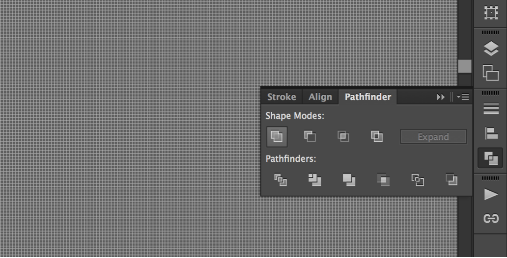
In the Pathfinder palette, use the first Shape Mode: Unite
SVGs and Potential Problems
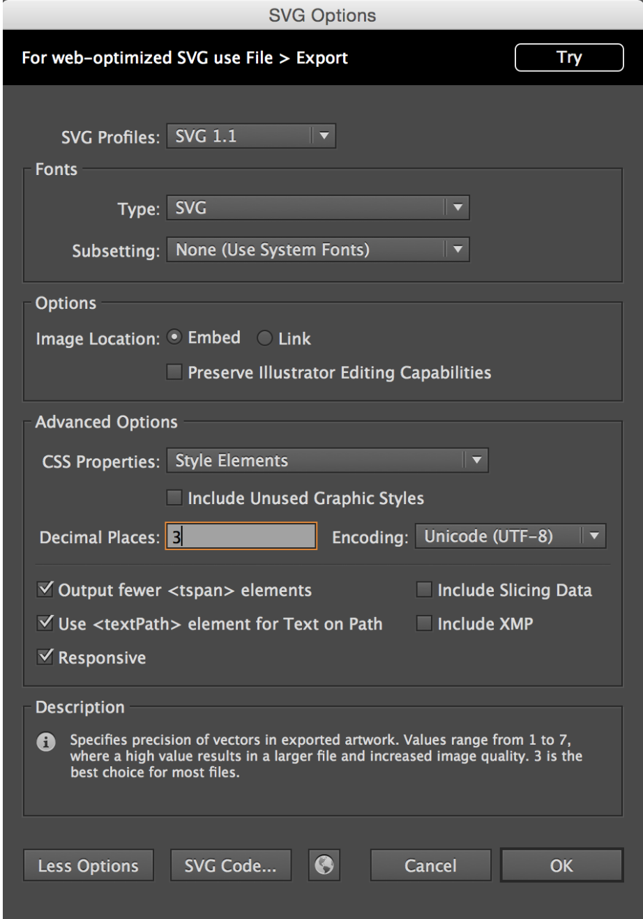
Save out each artboard as it’s own SVG. If you run into an error where it looks like your icons edges are pointy on export, double check your file (optically and in your Transform palette) to make sure that you have proper alignment and whole numbers. If you’re sure you’ve set up everything correctly and that it’s just being irrationally picky, adjust the decimal places in the SVG settings—3 places will usually fix it.
Font-ifying
To make them into a font, just upload the SVGs to an icon font app —we use Icomoon. Their steps to are really easy to follow and implement. Just make sure that, once you’ve created a set, the app’s grid settings parallel whatever size you used in Illustrator.
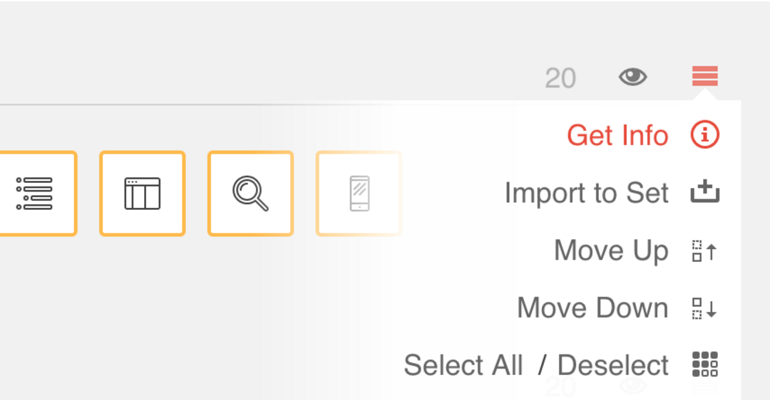
Next to the set, Hamburger > Get Info > Reset Grid Size
And that’s it!
Now that you know the technical side of iconography, experiment with the look and feel until you find a style that works for you. Just remember that icons by nature are intended to be simple and communicative, so it isn’t a place to get tooooo detailed.
Conforming to a grid could be a little more challenging than freestyle, but it’s definitely worth it for pixels that shine. Happy iconing!