We recently launched Custom Components. Powered by our MDX-backed editor, you can now build your own customizable and reusable components and add them to any Guides and API Reference pages within your ReadMe API documentation! Custom components—think buttons, page banners, graphs, image carousels, and more—are a really powerful and visually impressive way to make your docs more engaging, dynamic, and interactive.
MDX, which blends Markdown and embedded JSX, is built on top of React. When you write MDX files, they are essentially React components behind the scenes. An MDX component is effectively a React component written using Markdown syntax. If you want to include interactivity in your MDX component, you’ll need to import React libraries or custom React components. This is because MDX files compile to JSX, and React components are foundational to adding dynamic behaviors.
Additionally, the customization options available to you when building a component are virtually limitless thanks to built-in Tailwind CSS styling support.
With so much flexibility at your fingertips, it can be a tad overwhelming to know where to begin. So to help you get started, we’ve created this handy guide to walk you through building a Stepper component, step-by-step (pun intended 😉)— from using React to create the component, to styling it with Tailwind, to adding it to a Guides page in your docs, and finally, publishing it for your end developers to see and use.

Creating a Custom Component in ReadMe
A prerequisite for building a custom component is that your project must be on the new, Refactored experience. If you haven’t upgraded your project yet, and are eligible to, you’ll need to upgrade in order to get access to this feature.
The Custom Components page is located in the Content menu of your project’s Editing UI! That’s where you’ll get started. Click the + icon to create a new component. You’ll see some example code that does in fact create the “Getting Started with Custom Components” box in the preview below, but for now we’ll want to delete out all of that code so we have a blank slate to start writing the code for the Stepper component.

Our goal is to build a Stepper component that displays numbered steps, includes a headline and subtext for each step, and clickable buttons that allow you to progress to the next step or return to the previous one. You can layer on all sorts of advanced customizations and visual styling but, for this example, we’re going to build a fairly simplified version.
Step 1: Name Your Component and Import React Libraries
First, we’ll name our Stepper component. Given that this is a relatively simple version, we’ll name it SimpleStepper.
Since we want our SimpleStepper to be dynamic so that visitors to your docs can click the Back and Next buttons to progress through the steps, our first step will be to begin by importing certain dependencies, namely React, useState, and useMemo to manage state and optimize child components.
import React, { useState, useMemo } from "react";
Step 2: Pass Children into the Component
The SimpleStepper consists of individual steps, so we’ll want to define the component to accept children props within the parent SimpleStepper. In this instance, each step will be passed as a child component. In React, and MDX, children can be a single element or an array of elements, depending on how many children are passed. This step also establishes the foundation for the step logic that we’ll be building to work correctly.
export const SimpleStepper = ({ children }) => {
  console.log("Children received:", children);
Step 3: Define the Steps as an Array
As previously mentioned, depending on how children elements are provided, they can act as a single React element or an array of React elements. For this example, since we’ll have multiple steps, we want to define the data structure as an array.
This code ensures that steps are always structured as an array, regardless of whether children is a single React element or multiple elements. We are using useMemo here because it caches the computed value (steps) and only recalculates it when children changes. Additionally, useMemo optimizes performance by preventing unnecessary re-renders.
const steps = useMemo(() => (Array.isArray(children) ? children : [children]), [children]);Step 4: Create a State Variable
Next, we’ll create a state variable called currentStep to keep track of which step is currently active in the SimpleStepper.
const [currentStep, setCurrentStep] = useState(0);useState(0) initializes the state so that the currentStep starts at 0, meaning the first step (steps[0]) is active when the component loads. The setCurrentStep is a function to update currentStep, so that when it’s called, it changes the active step. We’ll need this to ensure that when we click the “Back” and “Next” steps (or whatever you decide to name the buttons), the UI updates to show the correct step based on currentStep.
Before we move onto styling, let’s review what your full code sample should like like so far:
import React, { useState, useMemo } from "react";

export const SimpleStepper = ({ children }) => {
  console.log("Children received:", children);

  const steps = useMemo(() => (Array.isArray(children) ? children : [children]), [children]);
  const [currentStep, setCurrentStep] = useState(0);
Step 5: Styling Your Stepper Component
Now it’s time to start styling the SimpleStepper.
Part A: Define the Container Style
First, we’ll define a JavaScript object called ContainerStyle that holds the CSS styles for the SimpleStepper’s main container, ensuring it looks polished, centered, and easy to read. You can customize any of the properties in order to adjust the style of the container.
const containerStyle = {
    maxWidth: "600px", // Set component width to 600px
    margin: "40px auto", // Center component horizontally and add spacing to top and bottom
    padding: "20px", // Create space inside the container
    border: "1px solid #ccc", // Add light gray border
    borderRadius: "8px", // Round the corners
    textAlign: "center", // Center all text inside containter
  };
Part B: Ensure Spacing for the Step Indicators
Now that we’ve defined the styles for the overall container, we want to add spacing between the step indicators and the step content. This prevents crowding and helps to make the UI look more balanced.
This code defines a CSS style object and applies styling to the container holding the step indicators (the circles that show the current step):
const indicatorContainerStyle = { marginBottom: "20px" }; // Add a space below indicators
Part C: Styling the Indicator
The next step is to style each step indicator dynamically based on whether it's active or not.
const indicatorStyle = (active) => ({
    display: "inline-block", // Make the indicators line up horizontally
    width: "30px",
    height: "30px",
    lineHeight: "30px", // Center the text inside the indicator vertically
    borderRadius: "50%", // Make the indicator a perfect circle
    backgroundColor: active ? "#5A3E8B" : "#ddd", // Update active color for better contrast
    color: active ? "white" : "black", // Set text color: white for active, black for inactive
    margin: "0 5px", // Add spacing between indicators
    fontWeight: "bold", // Make the step number bolder for better readability
    boxShadow: active ? "0px 0px 10px rgba(90, 62, 139, 0.6)" : "none", // Reflect new active color
    transition: "all 0.3s ease-in-out", // Ensure animation transition when switching steps is smooth
  });
Part D: Style the Navigation Buttons
Next, we’ll use CSS to style the Back and Next navigation buttons in the SimpleStepper.
const buttonStyle = {
    padding: "8px 16px", // Add internal spacing inside the button
    margin: "10px", // Add space around the button
    border: "none",
    borderRadius: "4px",
    backgroundColor: "#5A3E8B", // Set the button color to purple
    color: "white", // Set the text color as white
    cursor: "pointer", // Change the cursor to a hand icon when hovering over the button
  };
Before we move on to adding the code that controls the navigation between steps, let’s review what your full code sample should like like so far:
import React, { useState, useMemo } from "react";

export const SimpleStepper = ({ children }) => {
  console.log("Children received:", children);

  const steps = useMemo(() => (Array.isArray(children) ? children : [children]), [children]);
  const [currentStep, setCurrentStep] = useState(0);

  const containerStyle = {
    maxWidth: "600px", // Set component width to 600px
    margin: "40px auto", // Center component horizontally and add spacing to top and bottom
    padding: "20px", // Create space inside the container
    border: "1px solid #ccc", // Add light gray border
    borderRadius: "8px", // Round the corners
    textAlign: "center", // Center all text inside containter
  };


  const indicatorContainerStyle = { marginBottom: "20px" }; // Add a space below indicators

  const indicatorStyle = (active) => ({
    display: "inline-block", // Make the indicators line up horizontally
    width: "30px",
    height: "30px",
    lineHeight: "30px", // Center the text inside the indicator vertically
    borderRadius: "50%", // Make the indicator a perfect circle
    backgroundColor: active ? "#5A3E8B" : "#ddd", // Update active color for better contrast
    color: active ? "white" : "black", // Set text color: white for active, black for inactive
    margin: "0 5px", // Add spacing between indicators
    fontWeight: "bold", // Make the step number bolder for better readability
    boxShadow: active ? "0px 0px 10px rgba(90, 62, 139, 0.6)" : "none", // Reflect new active color
    transition: "all 0.3s ease-in-out", // Ensure animation transition when switching steps is smooth
  });


  const buttonStyle = {
    padding: "8px 16px", // Add internal spacing inside the button
    margin: "10px", // Add space around the button
    border: "none",
    borderRadius: "4px",
    backgroundColor: "#5A3E8B", // Set the button color to purple
    color: "white", // Set the text color as white
    cursor: "pointer", // Change the cursor to a hand icon when hovering over the button
  };
Step 6: Control the Navigation Between Steps
Next up, we’re going to add the event handlers so that users can smoothly navigate between the steps of your component.
const handlePrev = () => setCurrentStep((prev) => Math.max(prev - 1, 0));
  const handleNext = () => setCurrentStep((prev) => Math.min(prev + 1, steps.length - 1));
These two functions control navigation between steps by updating the currentStep state. handlePrev moves to the previous step, while handleNext moves to the next step. The logic here ensures that the currentStep never goes below 0, preventing the navigation from going before the first step, and never exceeding past the last step.
Step 7: Render the SimpleStepper
Now it’s time to render the SimpleStepper so it displays the following:
- The numbered circles, or step indicators.
- The current step content.
- The Back and Next buttons for navigation.
What this does for the SimpleStepper UI:
- Displays the stepper in a clean and structured way, following the CSS styles you’ve added above.
- Shows the step indicators to track progress.
- Dynamically updates step content when moving between steps.
- Prevents navigation errors by displaying buttons when needed.
- Includes accessibility improvements for screen readers.
return (
    <div style={containerStyle}>
      <div style={indicatorContainerStyle}>
        {steps.map((_, index) => (
          <span key={index} style={indicatorStyle(index === currentStep)}>
            {index + 1}
          </span>
        ))}
      </div>
      <div aria-live="polite">
        {steps.length > 0 ? <>{steps[currentStep]}</> : <></>}
      </div>
      <div>
        <button
          type="button"
          style={buttonStyle}
          onClick={handlePrev}
          disabled={currentStep === 0}
          aria-label="Previous Step"
        >
          Back
        </button>
        <button
          type="button"
          style={buttonStyle}
          onClick={handleNext}
          disabled={currentStep === steps.length - 1}
          aria-label="Next Step"
        >
          Next
        </button>
      </div>
    </div>
  );
};
Step 8: Define the Reusable Step Component
Next, we’re going to define a reusable step component, SimpleStep, so that it serves as a building block for individual steps, ensuring that each one displays a title (header) and renders the step’s content (children). This also creates the flexibility that allows each step to contain different content within your SimpleStepper, by passing each SimpleStep as a child.
export const SimpleStep = ({ header, children }) => (
  <div>
    <h2>{header}</h2>
    <div>{children}</div>
  </div>
);
Step 9: Create the SimpleStepperComponent
You made it! Now it’s time to combine everything you’ve built into a dynamic component. For this example we’re going to create a stepper with three steps. Each step will have a unique header and description. Once you add this code, it’ll render the component in the preview panel of your ReadMe project’s UI.
return (
<SimpleStepper>
  <SimpleStep header="Step 1: Plan">
    Plan your documentation and gather resources.
  </SimpleStep>
  <SimpleStep header="Step 2: Write">
    Write effective and clear documentation.
  </SimpleStep>
  <SimpleStep header="Step 3: Review">
    Review and refine your content.
  </SimpleStep>
</SimpleStepper>
  );
You can customize the header and description, and add as many steps as you desire. For this example, here’s what each element is contributing to the party:
SimpleStepperwraps everything and manages the step navigation, including controlling which step is visible.- Each
SimpleStepdefines a step, containing a title (via the header prop) and a description (inside the component body). - The step indicators and navigation buttons work automatically based on step count.
Let's review! Here’s the full code sample that you can copy and paste into the Custom Components page of your ReadMe project:
import React, { useState, useMemo } from "react";

export const SimpleStepper = ({ children }) => {
  console.log("Children received:", children);

  const steps = useMemo(() => (Array.isArray(children) ? children : [children]), [children]);
  const [currentStep, setCurrentStep] = useState(0);

  const containerStyle = {
    maxWidth: "600px", // Set component width to 600px
    margin: "40px auto", // Center component horizontally and add spacing to top and bottom
    padding: "20px", // Create space inside the container
    border: "1px solid #ccc", // Add light gray border
    borderRadius: "8px", // Round the corners
    textAlign: "center", // Center all text inside containter
  };


  const indicatorContainerStyle = { marginBottom: "20px" }; // Add a space below indicators

  const indicatorStyle = (active) => ({
    display: "inline-block", // Make the indicators line up horizontally
    width: "30px",
    height: "30px",
    lineHeight: "30px", // Center the text inside the indicator vertically
    borderRadius: "50%", // Make the indicator a perfect circle
    backgroundColor: active ? "#5A3E8B" : "#ddd", // Update active color for better contrast
    color: active ? "white" : "black", // Set text color: white for active, black for inactive
    margin: "0 5px", // Add spacing between indicators
    fontWeight: "bold", // Make the step number bolder for better readability
    boxShadow: active ? "0px 0px 10px rgba(90, 62, 139, 0.6)" : "none", // Reflect new active color
    transition: "all 0.3s ease-in-out", // Ensure animation transition when switching steps is smooth
  });


  const buttonStyle = {
    padding: "8px 16px", // Add internal spacing inside the button
    margin: "10px", // Add space around the button
    border: "none",
    borderRadius: "4px",
    backgroundColor: "#5A3E8B", // Set the button color to purple
    color: "white", // Set the text color as white
    cursor: "pointer", // Change the cursor to a hand icon when hovering over the button
  };

  const handlePrev = () => setCurrentStep((prev) => Math.max(prev - 1, 0));
  const handleNext = () => setCurrentStep((prev) => Math.min(prev + 1, steps.length - 1));

  return (
    <div style={containerStyle}>
      <div style={indicatorContainerStyle}>
        {steps.map((_, index) => (
          <span key={index} style={indicatorStyle(index === currentStep)}>
            {index + 1}
          </span>
        ))}
      </div>
      <div aria-live="polite">
        {steps.length > 0 ? <>{steps[currentStep]}</> : <></>}
      </div>
      <div>
        <button
          type="button"
          style={buttonStyle}
          onClick={handlePrev}
          disabled={currentStep === 0}
          aria-label="Previous Step"
        >
          Back
        </button>
        <button
          type="button"
          style={buttonStyle}
          onClick={handleNext}
          disabled={currentStep === steps.length - 1}
          aria-label="Next Step"
        >
          Next
        </button>
      </div>
    </div>
  );
};

export const SimpleStep = ({ header, children }) => (
  <div>
    <h2>{header}</h2>
    <div>{children}</div>
  </div>
);

<SimpleStepper>
  <SimpleStep header="Step 1: Plan">
    Plan your documentation and gather resources.
  </SimpleStep>
  <SimpleStep header="Step 2: Write">
    Write effective and clear documentation.
  </SimpleStep>
  <SimpleStep header="Step 3: Review">
    Review and refine your content.
  </SimpleStep>
</SimpleStepper>
And here’s how it’ll look in ReadMe:

That’s it—you’ve successfully built a reusable SimpleStepper component using React and Tailwind! Just make sure to click the Update button in the bottom right to save your component.
Now it’s time to drop it into a page in your project, and further customize it so that it makes sense in the context of the page.
Step 10: Add the SimpleStepper to Your Docs
Let’s head over to a Guides page in our ReadMe project to show how to add the SimpleStepper to a page, and make page-level edits to it.
This ReadMe project documents the Owlbert’s Journeys API which offers interactive tours, dining recommendations, and audio guides for various cities around the world. Let’s create a Stepper component that instructs visitors on how to use the Audio Guides functionality.
You can pull up the menu for any component you’ve added to the Custom Components page in your Content section by typing < or using the Editor Slash Menu to navigate to the Reuse Content section.

Once you add the SimpleStepper component, it’ll automatically display the pre-populated steps, headers, and descriptions—all of those are editable.

Once you’re satisfied, click Save, navigate over to your docs’ live site by clicking View in the top navigation of your Editing UI and see how the SimpleStepper renders.

You can keep adding the SimpleStepper to any Guides or API Reference page and editing the number of steps, header, and description at the page level. If you make any edits to the code at the global level (in the Custom Components page), those changes will automatically apply to anywhere the component is used across your project.
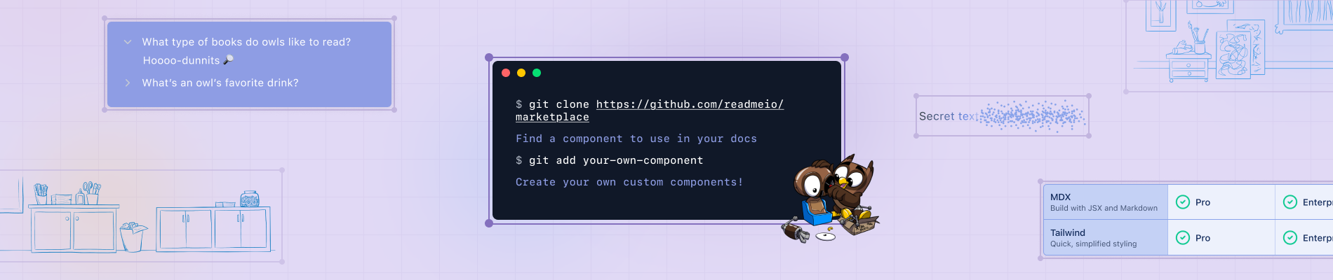
🛍️ Explore More Components in Our Marketplace
We have 5 pre-built MDX components—cards, accordion, tabs, columns, and mermaid.js diagrams—that are available (and ready to customize) via the Editor Slash menu in your ReadMe project. We also have a new GitHub marketplace where you can find a selection of community-built components that are ready to drop into your project, no coding required. Plus, you can build your own reusable custom components and submit them to the marketplace for other ReadMe users to explore and use!
👋 Join Us to Build This Component Live!
We’re hosting an interactive workshop on Thursday, March 20th where we’ll be building the SimpleStepper live. We’ll also be exploring other components on our GitHub marketplace and answering your questions. This is a great opportunity to build this component with our team, and ask any questions about MDX, JSX, or Tailwind! You can register for the event here.
We’re so excited to see how you use these reusable components to customize your API documentation and make them even more interactive for your developers. As always, if you have any questions, you can refer to our docs, reach out to our support team at support@readme.io, or share your question with other ReadMe customers via our Slack community. Happy building!