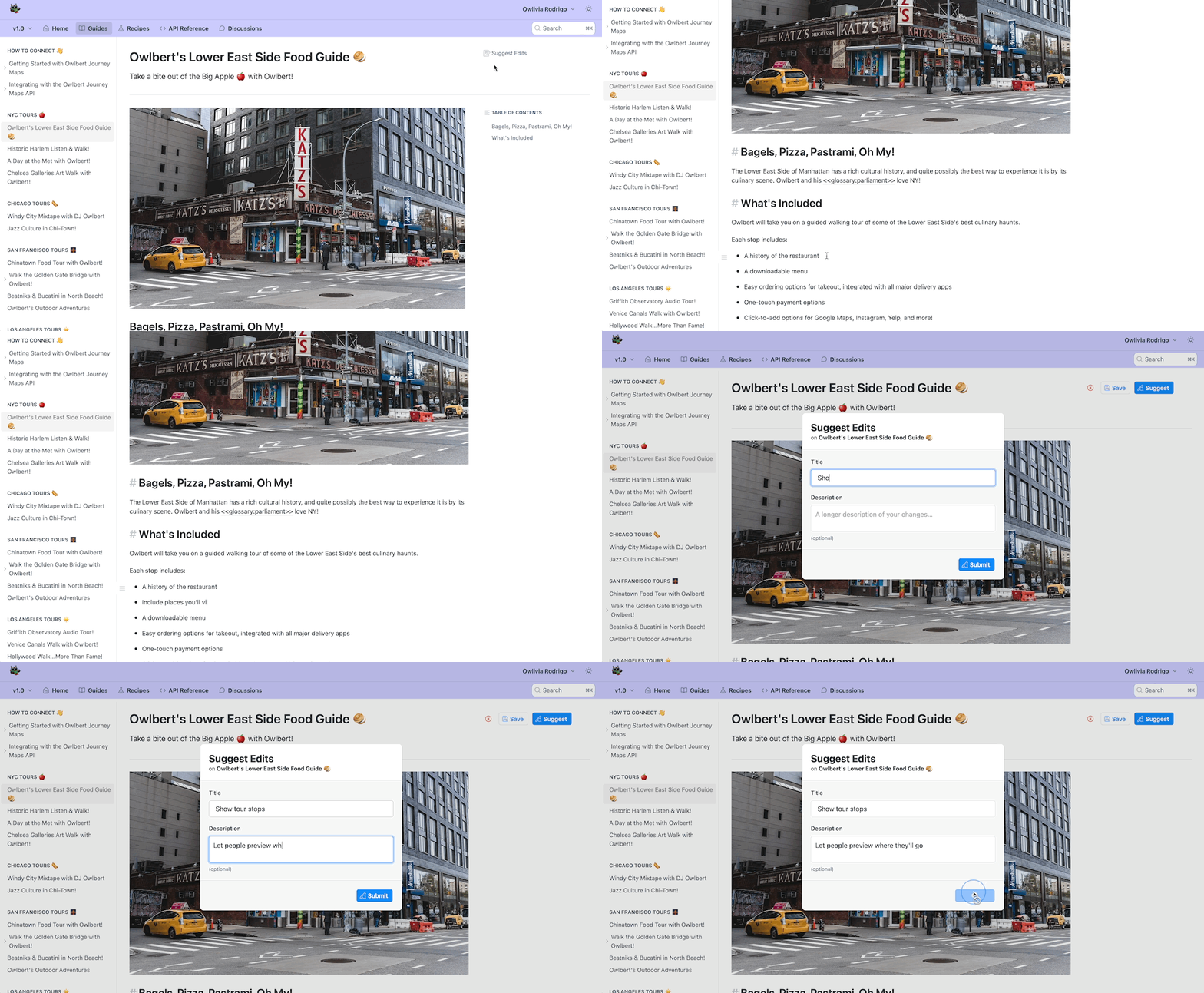
When it comes to documentation, it’s easy to focus on the reader experience — is it well-written? Easy to skim? Full of helpful code samples for getting started?
But creating that documentation should be a great experience, too. And most importantly, when making updates is a breeze, you’re more likely to keep your docs up-to-date for your users.
With that in mind, over the last year our team has been working on a new version of our Markdown editor focused on creating a lightning-fast, intuitive writer experience. We’ve also revamped the sidebar and page controls to make organizing your docs simpler, and better match the experience of the new editor.
Today, we’re thrilled to announce that the new editing experience is live. Keep reading — we’ll show you around 🥳

Get to Know the New Markdown Editor 👋
Our goal with this editor was to combine the best elements of Markdown syntax with the previewing abilities of WYSIWYG editors. We aimed to remove any unnecessary steps like the need for a separate “preview” mode and instead allow you to see your rendered text styling in real time. We also wanted to prevent the dreaded experience of finding yourself stuck in WYSIWYG mode, with no clear path back to plain text. Showing the Markdown syntax makes it easy to see where the formatting stops and starts, so you can focus more on writing your docs and less on fiddling with formatting.

The next time you create or edit a page in ReadMe, you’ll notice Owlbert welcoming you to the new editor experience and sharing a few tips. Here’s a few highlights of what to expect 🦉
- Quickly add headers, images, tables, and other embed blocks with the new slash command menu — just hit “/” to get started 🧱
- Easily copy and paste Markdown content into ReadMe, while maintaining all of the syntax and formatting, making content migrations a breeze ✂️
- Make quick formatting changes with a new in-line hover menu to bold, italicize, strikethrough, or link any highlighted text 🖌️
- Prefer to skip the menus? No problem — you can always format text using Markdown or use keyboard shortcuts to get the same results ⌨️
Build Great Docs with Blocks 🛠️
Our philosophy is that good docs aren’t just about words on the page — they’re about showing users the information they need to quickly get started or troubleshoot their problems. Being helpful and accessible is essential, but we’d argue they can (and should!) be fun to use, too 🎊

Embeds are a great way to do that — following the age-old writing advice of “show, don’t tell”! So we’ve updated everything about our docs blocks to match the new Editor features. Using embeddable blocks, you can:
- Surface useful examples and tutorials with code sample blocks and Recipes 🍳
- Embed content from third-party sites, like GitHub Gists or Loom videos, to support your written documentation with tutorials and demos 📹
- Use callouts, GIFs, blockquotes, and dividers to break up large blocks of text and give your docs some personality 😎
Find Your Way With New Navigation 🧭
The new editing interface isn’t the only improvement we’ve made to creating docs. Our fully redesigned sidebar makes it easier than ever to take a visual inventory of your docs and re-organize them to your heart’s desire 💞

With our newly revamped sidebar in Guides and API Reference, you can:
- Collapse pages into categories or their parent pages to make your content easy to scan 🔎
- Use the improved drag-and-drop UI to easily move pages between categories or re-arrange categories within your sidebar 👉
- Rename, delete, and move pages between sections from the three dot menu next to all pages and categories 🎲
- More easily access your project’s API Definitions, Getting Started, and Authentication pages, which are now anchored at the top of the API Reference section of the sidebar ⚓️
Our page controls have also gotten an upgrade — it’s now easier to view and change your page type, switch between your page’s status (public vs. hidden), and edit a page’s metadata. Plus, our upgraded Page History simplifies tracking changes between versions. Versions are now grouped by month and are collapsible, so it’s easy to go as far back as you need to to find the version you want.

Let End Users Give You a Hand
Why keep the new editing experience to yourself? We’ve upgraded our “Suggest Edits” feature to showcase a version of our new Markdown editor so that your developers can try it out too!

Whether a developer catches a simple typo or proposes feedback, enabling Suggest Edits makes it that much easier for you to know what changes are needed in your docs and crowdsource that help from your community! The Discussions section has also gotten an upgrade, so your developers can ask questions in style 🤩
Now It’s Your Turn ⏭️
You can watch a full demo on the new experience here, and read our docs on the new editor here and on the upgraded sidebar and page controls here. Most importantly, we hope you jump in and try it out. We’ve worked hard to make the new editing experience as delightful as possible, so we’d love to hear what you think ✨
Speaking of hard work, we want to take a moment to recognize all of the ReadMe team members who worked to bring these new experiences to life: Aaron Hedges, Brendan Luna, Daniels Lee, Ellie Rossuck, Ilias Tsangaris, Julia Hotaling, Kelly Price, Kevin Ports, Naomi Day, Rafe Goldberg, Ryan Visek, and Trisha Le 👏
As always, if you have any questions about it (or anything else), feel free to reach out via email at support@readme.io, or by sending a message via the Intercom widget in your dashboard or hub. Happy editing!


