
We tend to set a low bar when it comes to documenting our APIs.
Developers can stomach poring over dense docs for a product that they're interested in using, such as Google Maps or Twitter. Spending hours, days, weeks and falling into a support-searching rabbit-hole on Stack Overflow is practically an industry standard.
But what about the devs who don't know much about your product, and aren't sold on using it yet?
For people who aren't already familiar with your product, your reference doc is a window into your actual product. Including every edge case and tons of sample code isn't enough. Without a great UI, your thorough documentation will be utterly un-navigable, reaching only a sliver of your audience.
The goal is to get your API doc readers engaged and using your product faster. The only way to do that is by putting everything in a template that's easy to navigate through.
Here are the best UI features of a REST API template.
Keep Everything On A Single, Dynamic Page
Event Tracing (on Windows) has been cited as one of the worst APIs because its documentation is immensely frustrating to navigate. Event Tracing could be a useful tool since it's used to analyze machine performance, but its confusing docs scare most people away and endlessly frustrate the users who need it most.
When you go to the Event Tracing API reference library, you see this page:
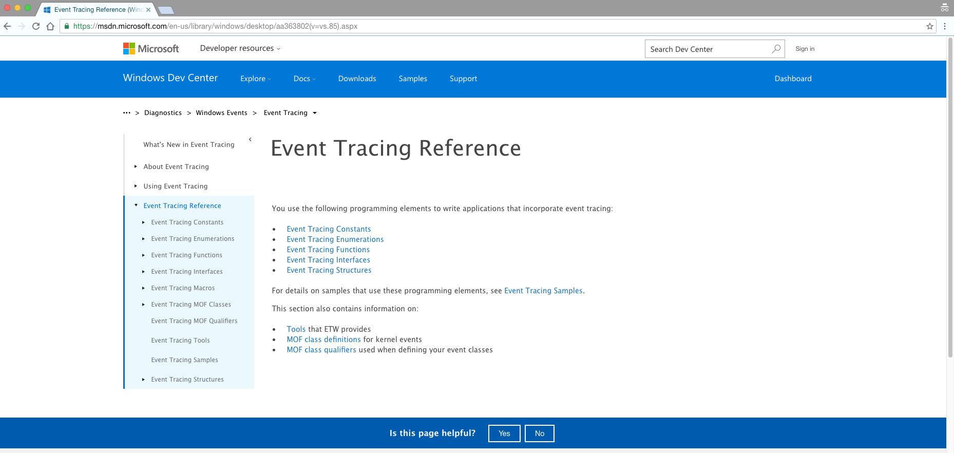
To see a simple GET command, you have to follow a series of steps: click “Event Tracing,” “Event Tracing Reference,” “Event Tracing Functions,” and scroll down a menu of about 30 functions until you're finally navigated to "TdhGetEventInformation function.”
When your users have to click through different links within your API reference docs, it becomes too difficult to find anything.
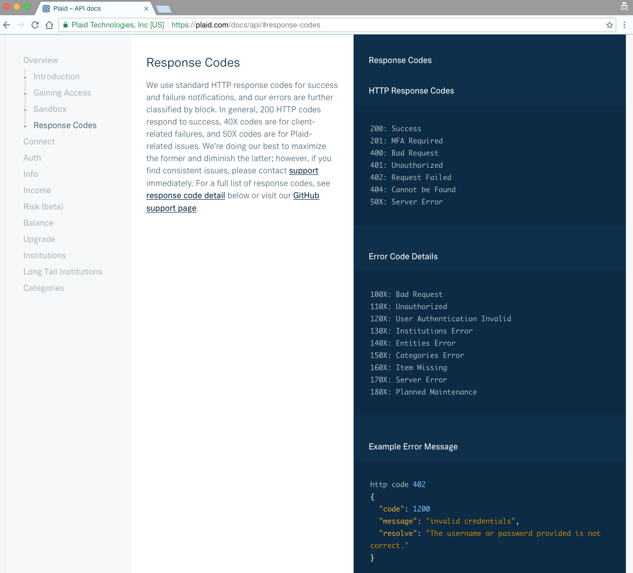
Compare that experience with what you get looking through Plaid's API doc. Plaid's developers put the most important info at the top—the introduction, authentication, and error-handling. But since the entire doc is on one page, readers with a burning question can CTRL-F the whole page to find what they need.
As Plaid shows, the simplest solution is to keep your entire document on one dynamic page. You can do that by including:
- Anchor links where your URL changes to match whatever section you're viewing.
- Navigation bars that hover on one side of your screen as you scroll through the document.
The anchor links on Plaid's API reference provide simple benchmarks for that section. The navigation bar on the left shows readers where they are within the doc's overall scope.
Instead of forcing your API users to navigate through an endless maze of links, put everything on a single, easy-to-navigate page. In a single page format, anything they need is at the tip of their fingertips—no clicking through page-after-page necessary.
Organize Your Doc in a Three-Pane View
Code without context is just code. That's why most docs include clarifications and summaries—so the reader can understand the practical applications of the code, and what their program will be able to do once the software is integrated.
But including these explanations and summaries isn't enough. They have to be accessible only when and where your readers need them.
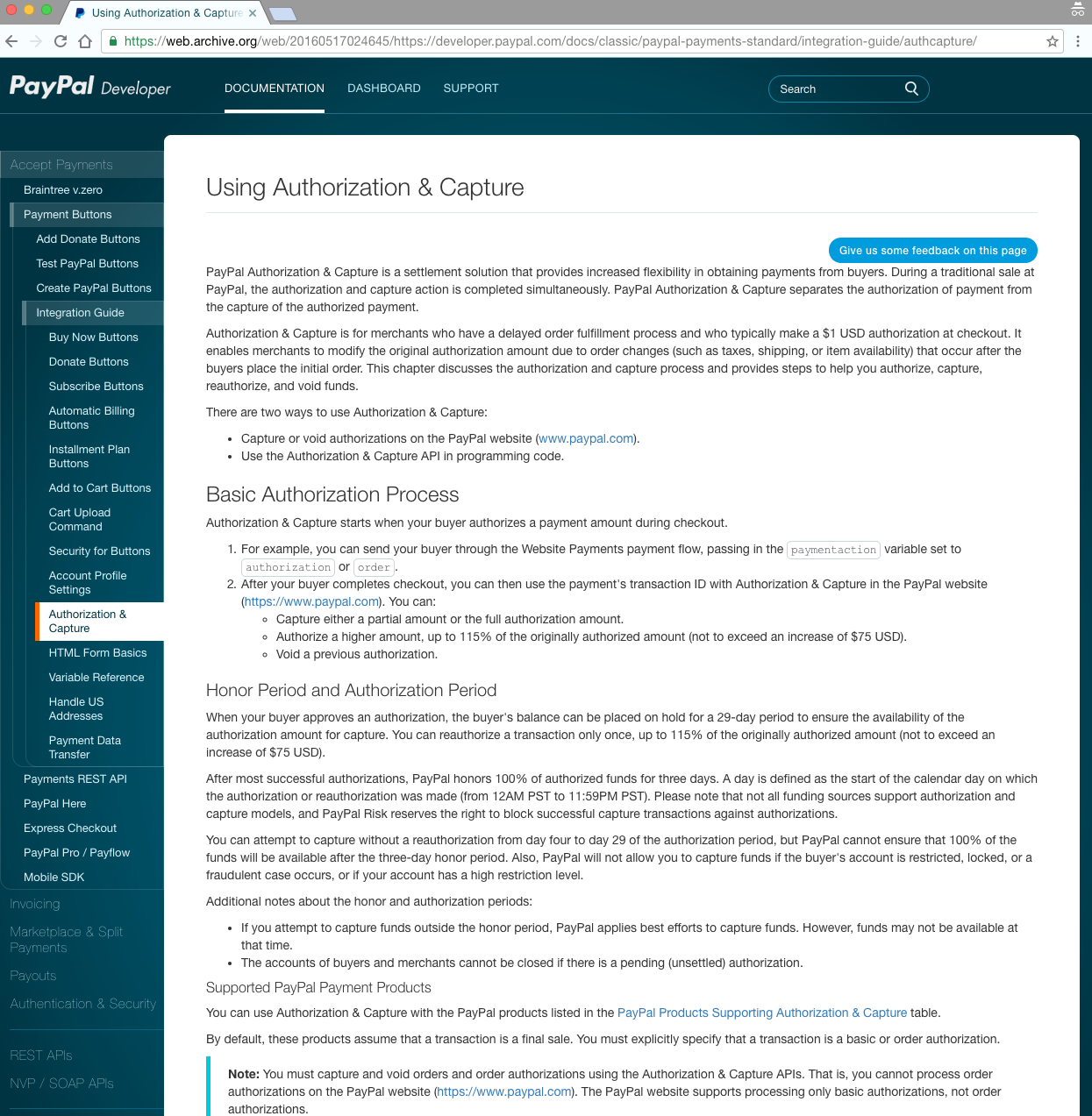
Paypal's original documentation site had two panes. But since its navigation bar was not dynamic, readers lost their navigation menu—and context—as they scrolled down the page. That's why critics of this documentation say that “the structure of the documentation is a catastrophe [...] The descriptions of how to set things up have no links to the APIs and the APIs are not linked to examples.”
A better solution—and one that Paypal later adopted—is using a single page with three panes.
Clearbit does this by putting dynamic nav bars in the left pane, explanations in the middle, and sample code on the right. Putting all the info together means that devs can see how everything works in context faster, and start trying their hand at the code sooner.
![]()
A three-pane view lets the user curate their own experience. It doesn't prioritize explanations over sample code (or vice versa). Whether you want to be briefed in plain English or to skim the sample code, a three-pane view puts all relevant info in one place and lets the user adjust as needed.
There's only so much real-estate on your screen. Letting readers curate their own experiences means they can choose what to look at, without you risking decisions that may limit your audience.
Let Readers Make Calls with an API Explorer
The #1 thing your API doc readers want is to see what your API is capable of—and the best way to do that is by giving them a chance to try it themselves.
Adding in an API Explorer lets you engage people of all technical backgrounds to make some of the most common calls in a few seconds, and without leaving your site.
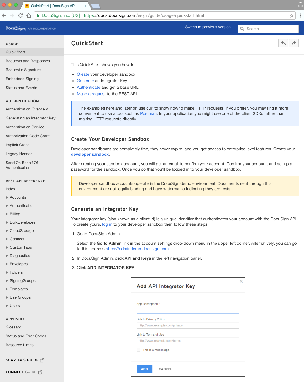
Quickstarts that let you create a developer sandbox are incredibly popular, but, they too come with some friction. Docusign requires the reader to first go to a separate page to create a (free) Sandbox account, verify their email, set up a password, and then they can set up their API key.
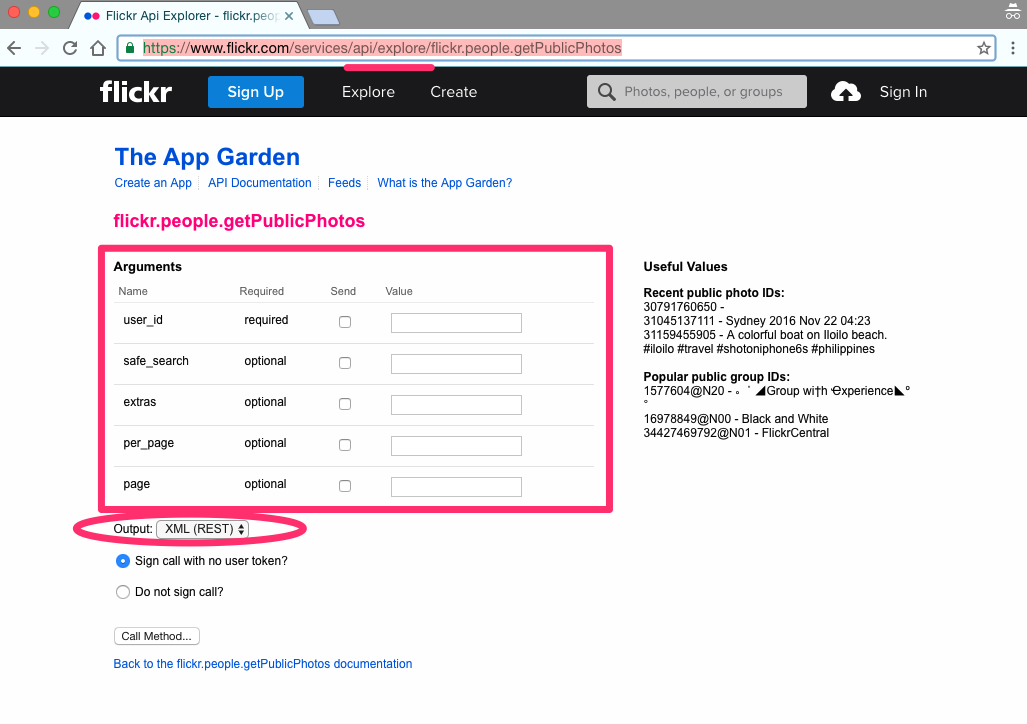
This works fine, and it's certainly better than setting up or adjusting your developer environment. But you can make this process even easier, by setting up an API explorer. Flickr's "App Garden," eliminates all that friction. It lets you make calls straight from the documentation page, no login or authentication necessary.
If your readers feel like it's a hassle to learn about your API in general, they'll be quick to abandon your site. The more steps there are to actually working with your API, the greater the barrier to entry. Having to create an account, log in, and navigate back is an absurd amount of steps to get a gist of how a product works.
The simpler you can make it for readers to reach your API, the sooner they'll learn what it's capable of.
Create Your Own Template
Most developerss would rather outline all their error codes than think about their documentation's UI. The truth is, you need to pair that with navigable UI to maintain your readers' interest—especially if they're not already familiar with the work you do.
If you want to save time building your own API template, ReadMe offers standardized templates that use these features. Click here to learn more.