Search is one of the most important parts of documentation. Even if all of the users questions are answered somewhere in the docs, if they can’t find what they are looking for it doesn’t matter.
We’ve spent the last few months totally rethinking our search from the ground up! We’ve changed how content gets indexed initially, how it’s searched when users type a query, and the entire interface for displaying results.
Redesigned Search Box
First let’s start with the most obvious change: the search box.
There were a few major issues with how we were displaying results before:
- The search box and results sliding to the left as the user typed was a very jarring experience
- Results from all over the documentation site often meant the result users were looking for was buried under discussion posts or results from an unrelated section
- Customers with multiple products had no way for users to filter to specific results related to what they were looking on
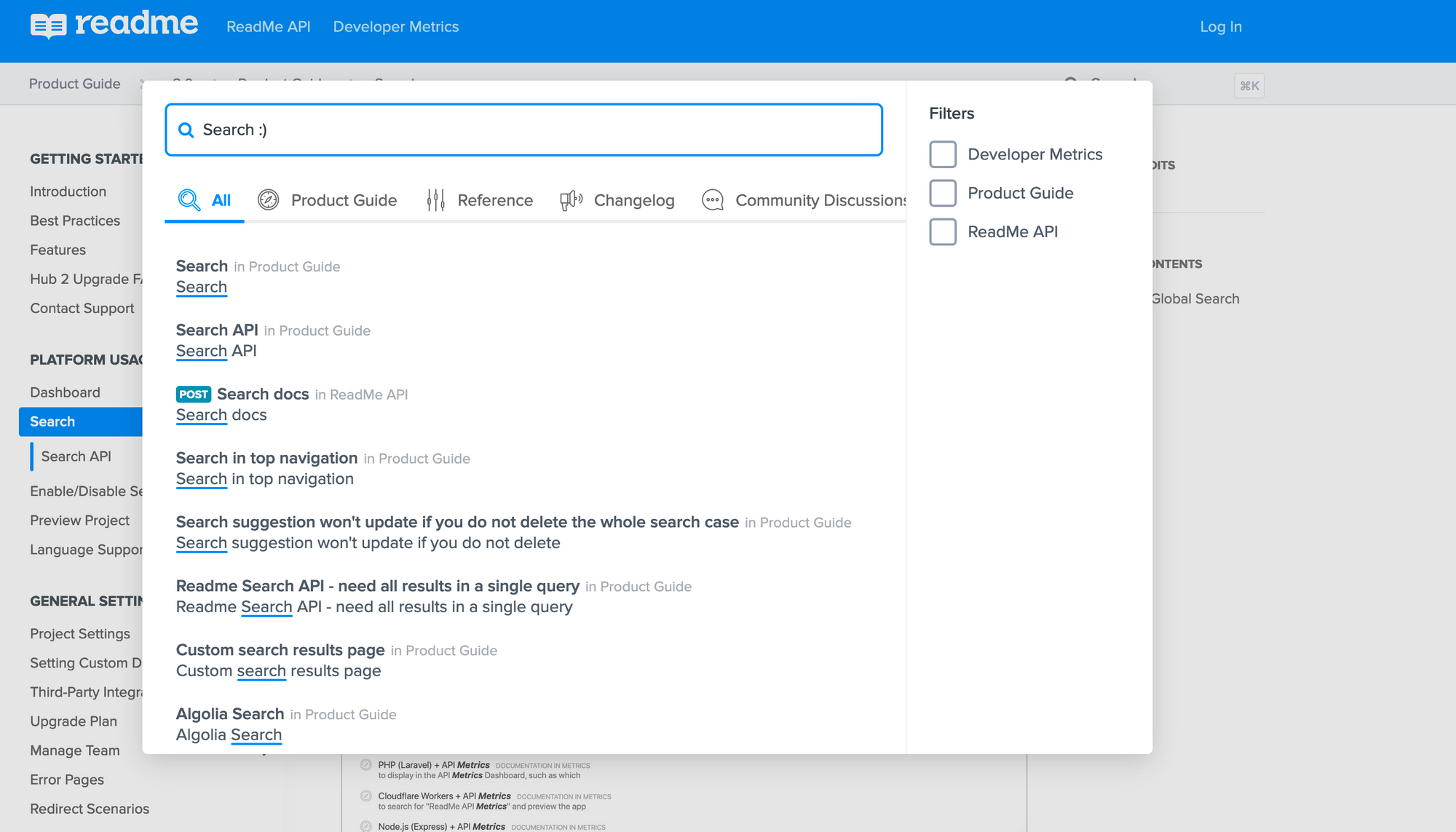
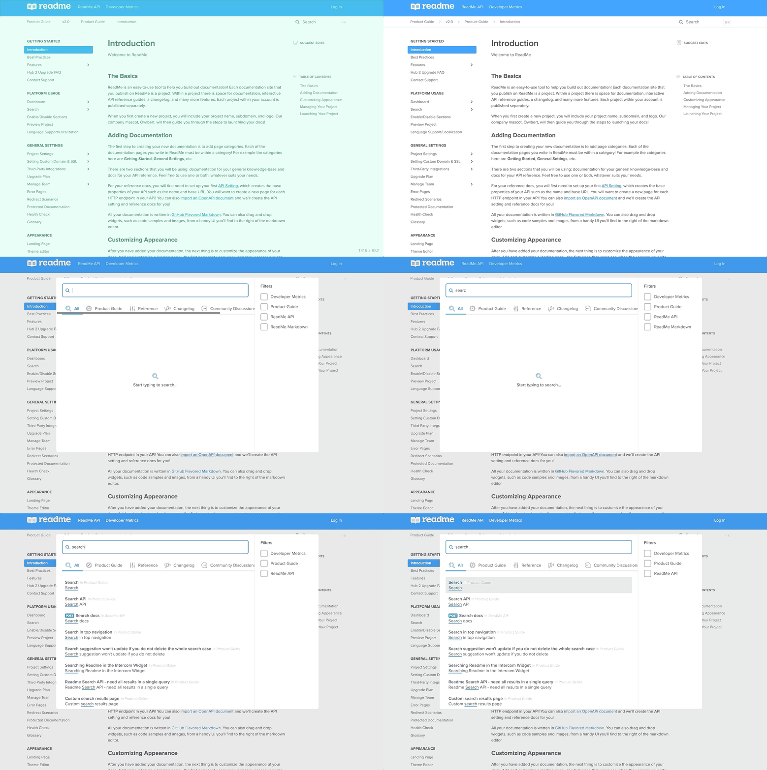
Introducing our new search box!

Now users can open search with cmd/ctrl+k, filter results based on what they are looking for, and when they click into a result it takes them to the exact spot on the page they were looking for. This new design for search results will start rolling out to projects this week!
Behind the Scenes
We’ve also been quietly making improvements to our search indexing and querying over the past couple weeks. Previously, due to limitations with how we were indexing pages over a certain length caused results to be less relevant. We rearchitected how we index search results to be based on smaller chunks from the hierarchy of the page. This means results are more relevant, easier for us to index, and the user gets taken to the part of the page including their search term.
We are very excited to roll these changes out to everyone! Search is critical to good documentation, and we always strive to have users find the content they’re looking for as fast and easy as possible.


