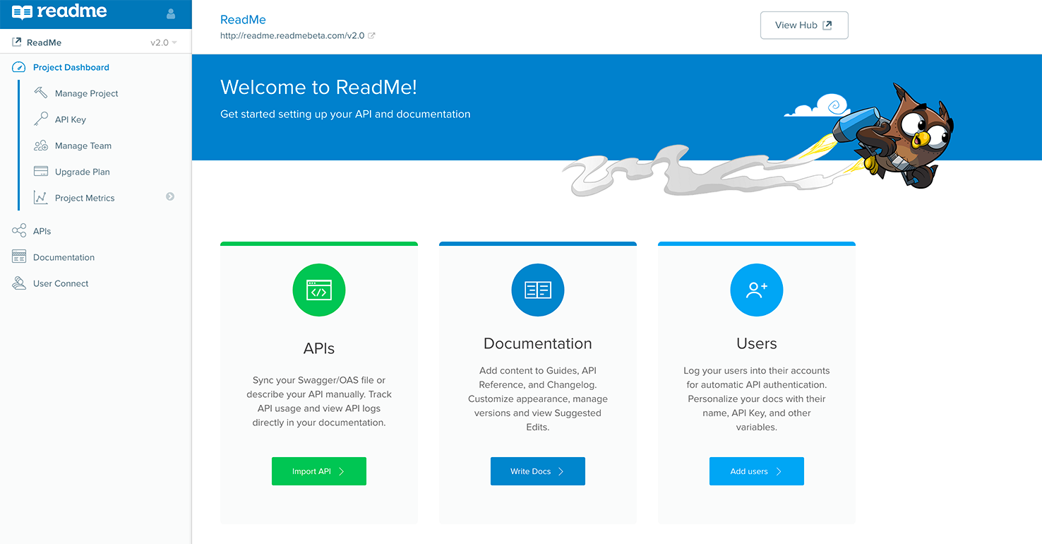
Over four years of adding features to ReadMe, our dashboard was starting to get a little bit cluttered, so we took a step back and did some fall cleaning!

In talking to our customers (and using the product ourselves), we realized there were four main sections that defined ReadMe. We cleaned up some cruft and organized our sidebar into these main categories. The dashboard is now broken up as follows:
- Project Dashboard: adding users to your team, managing project settings, and viewing metrics about how people are using your documentation.
- APIs: telling ReadMe how your API works, or uploading a swagger file. This is also the home of our newly launched API Metrics product!
- Documentation: update all of the content in your Developer hub, as well as the appearance.
- Users: set up authentication into your Developer Hub to allow your users to view more personalized content.
We’ve been using this new layout internally for a few weeks, and can’t wait for everyone to try it!
