You can now build custom components to make your docs interactive. They’re built using JSX and Tailwind!
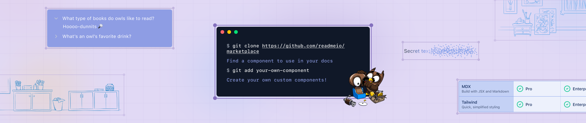
Want some inspiration? Browse our marketplace to see community-built components you can drop into your own docs to get started.
ReadMe provides interactive API documentation, and a big part of that experience is making docs feel dynamic, customizable, and developer-first. As we expanded our customization options, we started thinking that traditional Markdown was too static, and custom components required too much setup to be reusable. We needed a way to make docs as flexible as the APIs it describes.
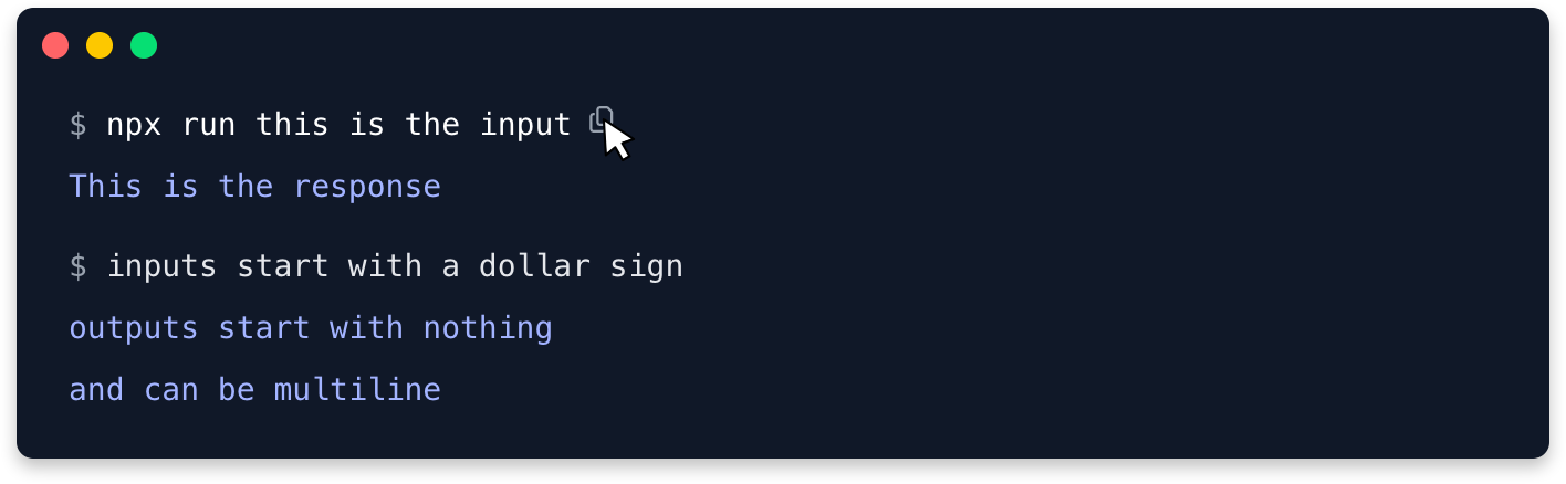
Graphs, buttons, banners, whatever you imagine – you can now build interactive elements as components in ReadMe to bring life to your docs. MDX allows you to embed JSX directly within your markdown content, enabling you to add dynamic, reusable components right alongside your docs. You can import components like faux Terminal windows, comparison matrixes, progress bars, and more to make your docs dynamic and engaging for users.

You could drop in fun components and customize your docs all while keeping everything portable so that it’s easy to share. However, components need to be as customizable in appearance and functionality as docs themselves. In order to make styling effortless, we invested in built-in Tailwind support, so teams can tweak designs without touching a single stylesheet.
Styling Components with Tailwind
Tailwind is one of the fastest growing utility-first CSS frameworks, where almost every styling property is handled using utility classes. By going all-in on Tailwind, we’d be able to provide ReadMe customers with thousands of compatible components out of the box–beyond the ones we built ourselves. The Tailwind ecosystem is thriving, and we want to empower developers to work with the tools they’re excited about.
Tailwind feels like a natural fit for components–it makes introducing predefined variables, like colors, seamless. If people prefer writing CSS, they can still use a <style> tag and paint the town (or component) red.
With our Tailwind support baked in, styling these components become effortless. Instead of wrangling CSS configurations, you can use simple, declarative utility classes to create beautiful, responsive designs right out of the box.
Getting Started with Components
Our goal was to make components easy to share with your teammates and easy to reuse across your docs. We made our MDX components as easy as they are powerful—which is why we’ve designed them to be lightweight, portable, and self-contained. Whether you're moving components between pages, sharing them with your team, or grabbing one from our marketplace, everything simply works—no unnecessary setup, no confusing dependencies.
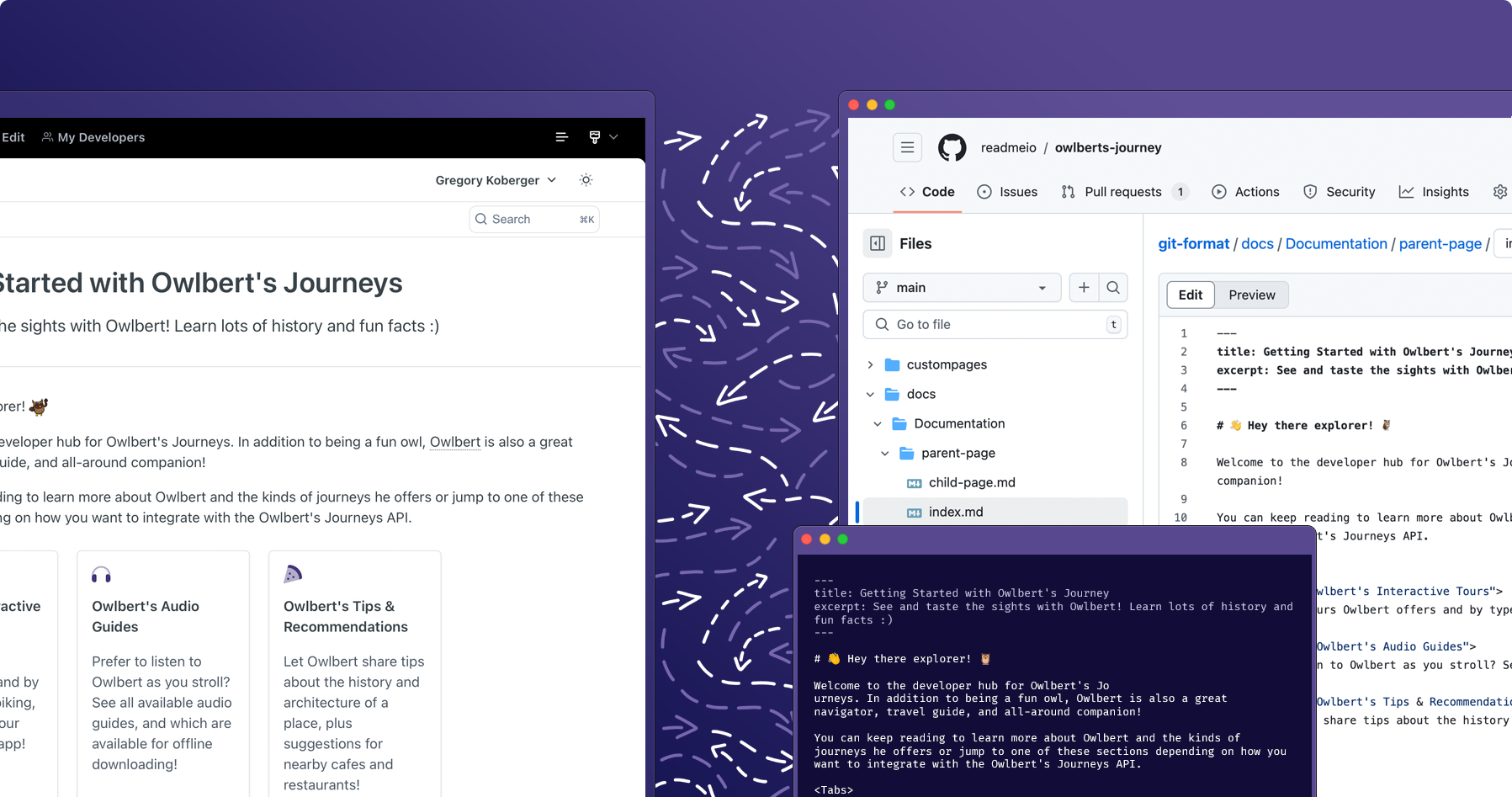
Check out our docs and then head to your project, under Edit mode, click the Content icon in the upper right corner next to the paint brush and select Custom Components in the left-hand menu.
Want to learn how to build your first component? Follow this guide to learn how to build your own stepper component to use in your docs.
If you want to take a look at some components to draw ideas, we’ve got a marketplace where you can find community-built components that you can drop into your project, or share your own.
If you need help getting started, say hi in Slack or send support@readme.io a note!