ReadMe just got a facelift! After a year, it was time for a refresh. A new color, a new logo and a redesigned admin dashboard. We did this for two major reasons: to reflect how we want ReadMe to feel, and to get the UI ready for more substantial upcoming changes.
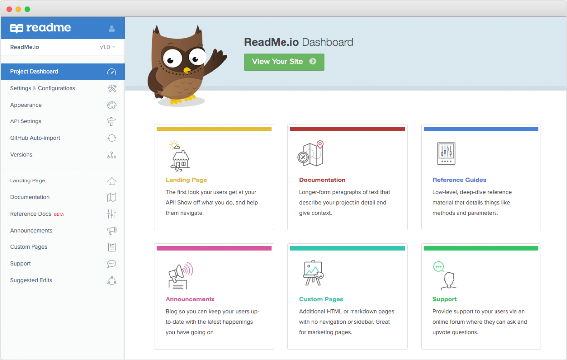
Meet our new Dashboard:
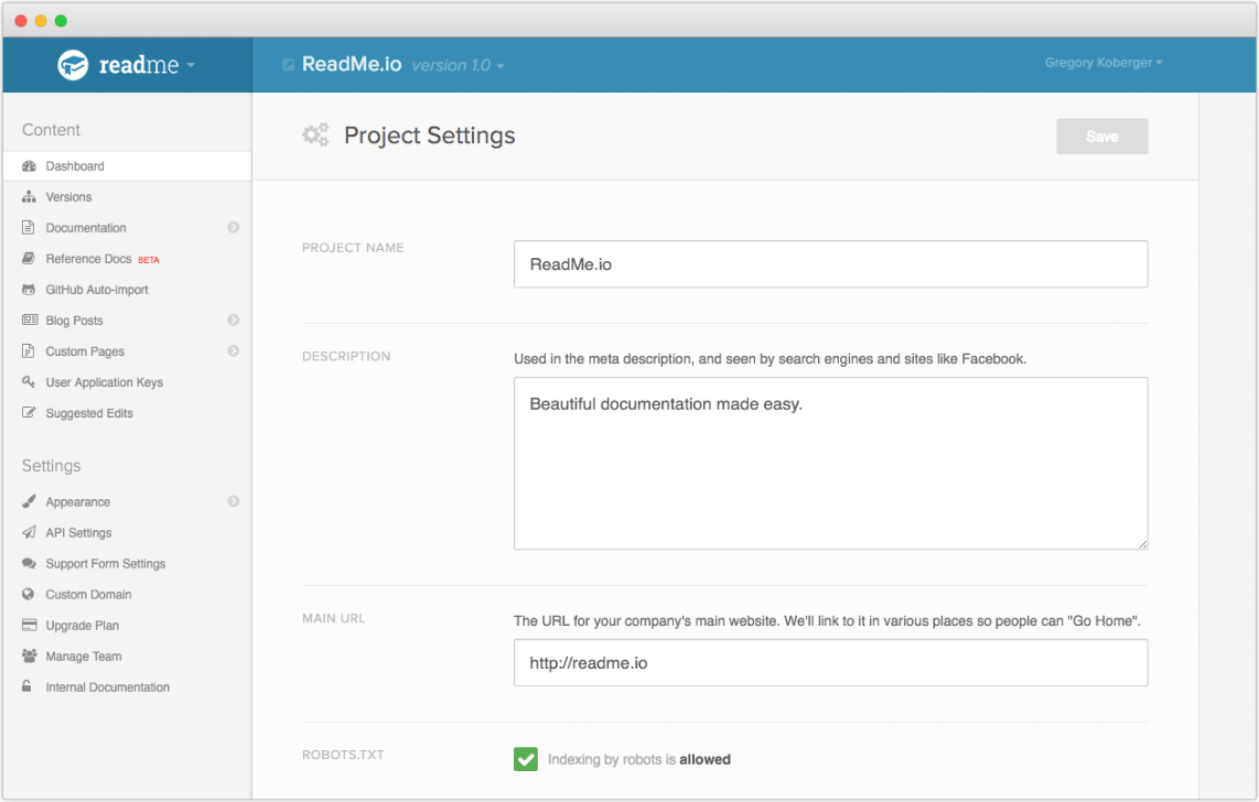
Here's the old one for reference:
Documentation is traditionally heavy and complicated. We want ReadMe to feel light and simple. So, our new logo, colors and redesign were done with that in mind.
New Logo
The first thing we changed was our logo. We wanted something that felt fresh and new, while not deviating too much from the old logo and brandmark.
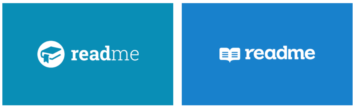
Our original, multi-weight Roboto Slab typeface was replaced by a modified version of Sanchez. We wanted the logo to feel more confident and cohesive, as opposed to the choppy previous iteration. It was also important that it works at smaller sizes: the thin “me” in the original logo never felt right when scaled down.
For the brandmark, we wanted to downplay the literal book, without completely replacing it. A book evokes the exact opposite of what we’re trying to accomplish at ReadMe: we believe that documentation should be dynamic and tailored to each individual user. We also retroactively tacked on some hidden meaning: we found it kindaaa looks a bit like either a heart or an owl… if you squint hard enough.
The new brandmark has much more personality now, and we’ve animated it everywhere we can. It’s not just the loader in the dashboard. We also gave it a bunch of sweet dance moves – so when you’re in the dashboard, mouse over it.. and again.. and again!
Huge thanks to Amy Devereux for helping out with this!
Dashboard
Aside from feeling a bit lighter, we wanted the dashboard to be more functional. ReadMe is growing, and we keep adding new “sections”. It was quickly getting a bit overwhelming, and we never really explained what each section did.
Rather than dumping users into a Settings form like we had been doing, we wanted the main page of every project to help you get a quick overview and navigate better. So, the dashboard now acts as a launch pad for all the various sections of your ReadMe project. And, in the coming months, we have a bunch of new sections we’ll be adding to the list.
Some changes are superficial (such as the new color), some fix long-standing ReadMe usability issues (like being able to scroll the sidebar separately from the content when editing documentation), and some set us up for the future (like clearer navigation on the homepage). Overall, it will hopefully be a solid first step toward making ReadMe simpler, easier and more powerful.
Have feedback? We’d love to hear it!